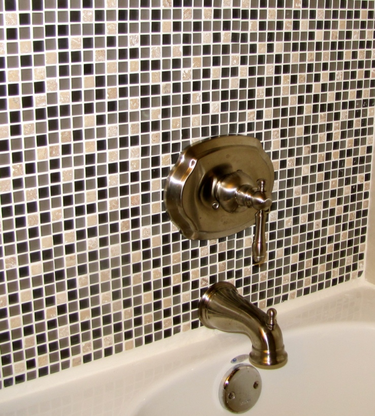
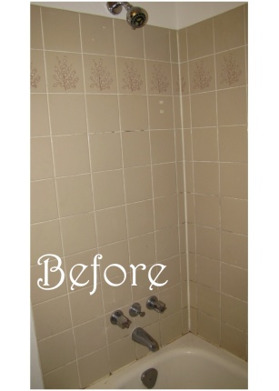
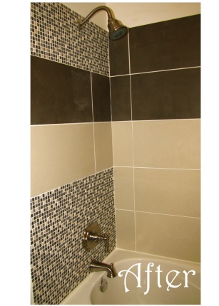
Last month I shared with you Part One of our bath room overhaul, but to refresh your memory, I will share with you the before. This is the original tub and tile from the 80’s (when our house was built) and it was in desperate need of an update. We sourced our new tile from our local Habitat for Humanity Restore- brand new and still in boxes, but for a fraction of the cost- and then “splurged” on some complimentary mosaic. This was both for aesthetic and practical reasons. The tiles we used measure 24″x12″ so cutting holes in the middle for the plumbing fixtures was not something within our skill set. With the mosaic, you simply cut along the mesh backing to remove the tiles where needed. Mosaic is so easy to put in and in my opinion really does add a little “something” to the space!
So, a quick refresher- this is what we started with.
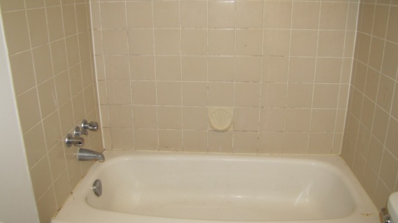
If you are interested in checking out the demo details of this baby you can see more here.
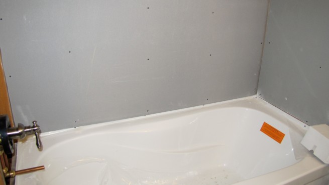
Once we had the new tub in and had confirmed that our plumbing was sound and good to go, we installed the waterproof backer board. This was simply screwed onto the existing framing. It was interesting to note that the previous wall was just regular drywall, and there hadn’t seemed to be any mouistur problems. Remember when putting in or updating plumbing, to follow the instructions for your specific fixture, especially if it is a tub/shower combo- there are minimum and maximum distances for the faucet, handle and shower head- and if you don’t follow these guidelines you may have an inoperable system! So, read those instructions! 😉
We measured everything- 20 x’s to be sure we had the proper distances for the shower head, spout, drains and handle!
The Big Reveal
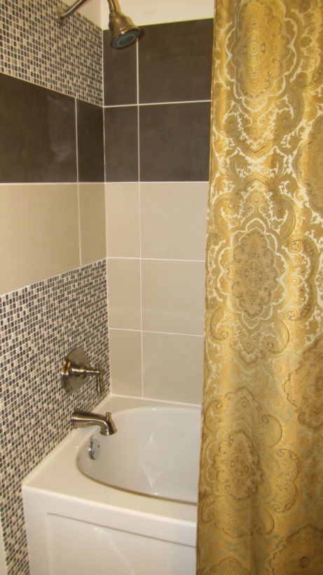
Without further adieu here it is: our new tub and shower surround! (please excuse the residue dust!)
Isn’t it lovely. I must say I much more enjoy bathing in this than our old tub… before I wanted to get out of there as soon as possible, and couldn’t help but inspect whatever it was that was brewing in the grout lines. This feels much more peaceful and inviting.
Our bathroom is not very large, and is used as both our family bathroom and the guest bathroom. I wanted to give the illusion of space and bring in a bit of calm. We have a small bathroom downstairs with a stand up shower… what other type of showers are there? I don’t know, but stand up seemed to be a good descriptor, as you can’t do much else in there… for example, you might whack your elbows when washing your hair… Thats where we showered during this whole process, and I will just say that E may have gone a long time without bathing, and G took a few sink baths…
I didn’t take a lot of pictures of the in between process, but after the new sheet rock was in place, it was time to put the tiles up! I would reccomend spacers when doing wall tiles, especially if they are large and heavy like these ones. I DO NOT recommend using “eco” products which I unknowingly bought (both mastic and grout) because that was all Totem was offering up, but long story short… they are weird. They don’t adhere the same, and the grout was the strangest texture/ and it was difficult to find that “peanut buttery” consistency. We went unsanded as this was a recommendation when using glass tile, which was in our mosaic pattern- and this stuff was a pain in the butt to clean… if it wasn’t runny, it was drying… just not a great experience, but we got it done none the less!
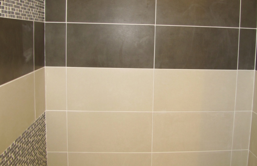
Now I kind of made my husband go against some of his “tiling rules” with this project, because I wanted the pattern to have long lines, while using the most full tiles we possibly could, because I think big tiles are sweet… so, why chop them up! And why not centre them along the back wall, which is where you will notice them most. So we did. And we also placed the longest tile near the outside of the tub surround, so that again, there was the extension of the lines… I am pretty happy with how it turned out. And while this is not our forever home (if there ever will be?) and not my usual design taste, I think this is a drastic improvement from what we had before, and still has a bit of our signature on it, in that it is not your regular white tub tile, or shower insert… It is thrifty and chic 😉
Both the color scheme and the scale of these tiles have a more modern feel, so I wanted to bring in a bit more of a classic element with our fixtures. We chose a set in brushed nickel that gave us the look we wanted without the price tag. I wanted to move away from the two part handle, as I didn’t like that hot hot water could be turned on, if one of the boys ever did so-. It was also harder to regulate the temperature with the old system. Now when the water comes on, it is cold to start and then you can gradually bring up the temp.
Here are a few things I love about our new tub:
- a modern plug! no more little rubber dude that slips out of place our gets pulled out by little fingers
- it reclines
- you feel cleaner when you exit it
- mosaic tile ( I love the look of it)
- clean spraying shower head!
- arm rests
Well, there you have it! That was our bathroom makeover… technically the tub, but- it really made the difference! If you are wondering, we have done the bathroom ins stages, so the toilet, flooring, vanity and light fixture we all previously updated, and this was the last stage of our reno. Hope you enjoyed this project! I have some exciting before and afters coming up, including a pretty major makeover of my sister in laws brick wall fireplace! I will just say, that I *love* the after 😉
Hope this inspires you to tackle some of the more major projects in your place!
